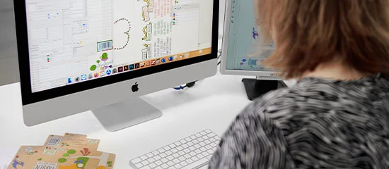
Beautiful boxes in corporate design
If a company wants to be more than its products and services and convey a positive and memorable brand feeling, a well thought-out corporate identity is necessary. A large part of a company's identity is the visual presentation at all touchpoints; the corporate design. How do you develop a successful corporate design and use it to convey your corporate identity?
THE IDENTITY OF A COMPANY
Corporate identity, i.e. the identity of a company, is the self-image of a company. A successful corporate identity should be reflected in every entrepreneurial action and transaction. Thus, the company should have a recognition value. At trade fairs, eye-catchers such as labels help the company to be remembered. In addition to corporate identity, there is also corporate image. It describes the external image of the company, i.e. how the company is seen from the outside. Ideally, corporate image and identity are identical.
The foundation of the corporate identity is based on the corporate philosophy, the long-term objectives and the image of the company. These elements must be found, developed and analyzed. It is about how the company represents itself externally and internally, how it presents itself and how it behaves. Of course, this is always done with a view to the company's history. Especially traditional companies can use their background and history to present themselves. However, one should never forget to look to the future.
Not only the company itself, but also its competitors, customers as well as employees must be involved and included in the creation of the corporate identity. In order to be able to develop it, the first thing to do is to conduct a detailed analysis of the competition and the industry. How do competitors present themselves, what identity do they embody? The most important thing is to find industry standards. In this way, you can filter out and use your unique selling points. They are essential for corporate identity.
The primary goal of a successfully executed corporate identity is to present the company within a uniform framework. To achieve this, all components of the corporate identity must mesh and harmonize perfectly. The four most important components besides Corporate Language, Philosophy and Soul are:
- Corporate Behavior - the corporate behavior: What behaviors, internal as well as external, make up the company? It can include factors such as environmental awareness and the company's social and philanthropic interests.
- Corporate Communications - the corporate communication: How does the company communicate with customers, partners or employees? For example, what do support, service or advisory meetings look like?
- Corporate design - the corporate image: How does the company present itself visually? Corporate design includes, for example, the appearance and design of promotional items, products or the sales premises.
- Corporate Culture : What values and norms are implemented during corporate actions and interactions? The corporate culture determines, for example, the way the company works, the rules of cooperation or the treatment of customers.
Corporate Design
Advantages and purpose of corporate design
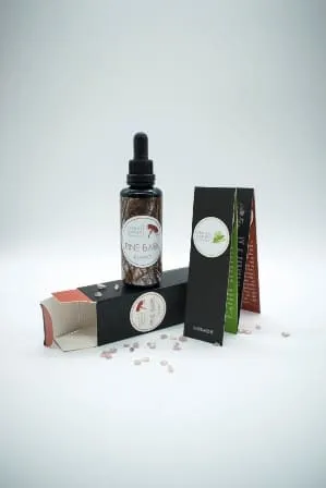 The corporate design encompasses all communication elements of a company and represents the basis for all visual elements. The corporate design serves to visualize the corporate culture and goals as well as the company's values. In other words, everything that makes up the corporate identity. A corporate identity creates continuity in the actions of a company. As soon as these happen outside the company boundaries, the corporate design helps enormously to continue this continuity. A broad-based corporate design serves to create trust and credibility through uniformity. If a company consistently provides consistent quality and does so in a recurring design, the company's design is equated with the high quality standards of its products. This creates a positive brand feeling.
When designing the products and especially the packaging for products, the corporate design should be applied, in the form of the logo, the color scheme as well as the design elements. For the customer, who has already come into contact with the designs through various touchpoints, everything comes together with the purchase of the product. The company presents itself in a continuously consistent way, making it easier to understand the company's identity. This creates a closer customer bond.
Design
A good corporate design is not created in a hurry. However, it is well worth investing some time in its development. There are many suggestions and tips on how best to proceed. We would like to briefly explain the most important tricks and what you should bear in mind here.
Nachdem man die Ziele und Grundelemente seiner Corporate Identity gefunden und entwickelt hat, geht es daran, ein dazu passendes Designkonzept zu erstellen. Gewisse Eigenschaften der Corporate Identity können eventuell in visuelle Elemente umgeformt werden, die Inspiration oder Grundlage für Designelemente bilden können. Die Designkonzeption sollte möglichst ausführlich sein und alle Elemente der Unternehmenskommunikation mit einbeziehen. Es sollten feste Vorgaben für Typographie, Logos, Designelemente und Farbschemata gemacht werden.
After finding and developing the goals and basic elements of one's corporate identity, the next step is to create a design concept to match. Certain characteristics of the corporate identity can possibly be transformed into visual elements that can provide inspiration or the basis for design elements. The design concept should be as detailed as possible and include all elements of corporate communication. Firm specifications should be made for typography, logos, design elements, and color schemes.
- Red: enthusiasm, confidence, passion, urgency
- Yellow: optimism, joy, satisfaction
- Blue: authority, security, responsibility, strength, refreshment
- Green: health, rest, growth, relaxation
- Orange: enthusiasm, warmth, energy
- Lila: Purple: calming, creativity, luxury
A red box can convey enthusiasm, confidence and passion, and the expectations attached to these characteristics are then unconsciously transferred to the product. A product packed in a blue box is therefore associated with safety, strength and refreshment. Therefore, when choosing a color scheme for the corporate design, one should always consider which characteristics of the product the packaging and other advertising materials should convey.
Logo design is one of the most important parts of corporate design. It is what ends up standing out because it appears at almost every touchpoint and is often what is most memorable. That's why it's important to design a logo that is simple in design, but unique. It should pick up the color palette as well as typography of the overall corporate design. When choosing design elements to use on product packaging for embellishments and accents, for example, care should be taken to ensure that they harmonize with the logo.
Since companies today use many different platforms for display, and often in different configurations, care must be taken to ensure that the corporate design can be applied to all touchpoints. It should be suitable for both the stationary view and the mobile view of a company's website, programs and applications. It must also be applicable in digital and analog communication.
IMPLEMENTATION OF THE CORPORATE DESIGN WITH BEAUTIFUL BOXES FROM LABELPRINT24
The corporate design should be used across all channels and at every touchpoint. During the customer journey, the customer should regularly come into contact with the design. This increases familiarity and recognition. It is particularly important that the customer recognizes the elements of the corporate design in the product and its presentation. Special focus should be placed on the product packaging; it is the only advertising medium that reaches every customer. To ensure the smooth application of the corporate design, companies create so-called corporate design style guides, which describe the corporate design in all its elements and characteristics. Thus, the style guide represents instructions and recommendations for the use of the corporate design.
Corporate design boxes are not only applied as simple product packaging. Depending on the box shape, material or design, beautiful boxes can be used in any way. For example, as a gift box, jewelry box, storage box, bottle box or food packaging.
When developing the corporate design, you should think about how and where it will be used. If you want to apply it to boxes, it should be catchy but still subtle. This way, the beautiful box leaves a lasting impression on the customer and encourages further use, for example as a storage box.
The following three examples describe how a corporate design can be applied to beautiful boxes from labelprint24.com.
Detergent packaging in corporate design
As already described, relevant aspects of the company and its products should be reflected in the corporate design. The company "Cleanatics" produces high-quality detergents. The corporate design of the company can be interpreted as follows based on the products and product packaging:
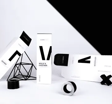
The products, like the company itself, stand for cleanliness and hygiene. Characteristics associated with cleanliness are order, safety and quality. All these qualities are reflected in the corporate design. White is widely associated with cleanliness and tidiness. Thus, it represents the main color of the beautiful box. In combination with black, it stands for simplicity and order. The simple, geometric design of the white box stands for order and gives the customer the feeling of buying a modern, neat product. Together with the high quality of the packs and the print, these elements form a continuous corporate design that integrates well the characteristics of the product.
Folding boxes and package inserts for food supplements
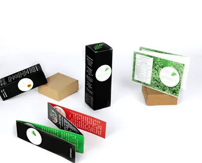 The company "Herbal Garden" produces herbal dietary supplements, which are supposed to have a positive effect on health. The simple package design of the beautiful boxes can be interpreted as follows from the point of view of corporate design: Mainly, the packaging is black, which stands for seriousness, functionality and practicality. Qualities that many companies, especially those operating in the healthcare industry, want to exude. In addition, the color green is used. On the one hand, it can be found in the logo in duplicate on the packaging, as well as in some enclosed package inserts. Green radiates calm and relaxation, and it also stands for health and growth. These are qualities and effects associated with a healthy lifestyle. A connection with nature is also signaled by the color green. This makes a lot of sense for products of a company that values natural and environmentally conscious production and supports the representation of corporate identity. In addition to the color green, the color red is also used as an accent color. Red and green are complementary colors. In combination, they stand for liveliness and expressiveness. As this color combination can be found especially on the information brochures, it underlines their expressiveness. The effect of liveliness has a positive impact on the association with the products. Especially in the case of products from the medical field, attention should be paid to qualitative presentation. This includes the product itself, as well as the outer packaging. This packaging is high quality, beautiful boxes with qualitative printing, which gives the customer confidence.
Custom folding box with cardboard slipcase in beautiful design
 Energy for Health is a company that offers an individual service based on highly sensitive customer data. With the help of the analysis box, samples are taken which are then analyzed for micronutrient concentrations in the body. Subsequently, the customer receives an individual evaluation based on these values and data about his personal lifestyle. With the evaluation, the customer receives his personal micronutrient formula, with which he can find health, vitality and strength. The company works with very sensitive and personal data. In order to build trust with the customer, the corporate identity must radiate security and responsibility. Thus, this must also be reflected in the corporate design, in this case on the product packaging. This beautiful box is a high-qualityhinged boxin acardboard slipcase. Its design allows for interpretations of the corporate design. The box and the slipcase are produced and printed in high quality. This underlines the professionalism and seriousness of the company and its products. The colors on the packaging are kept very simple. The biggest color component is the company's logo. This is in the form of a fingerprint. Fingerprints represent high individuality, which is why they work well as a logo for a highly personalized product. The two colors of the logo fit equally well with the corporate identity of the company. The color green stands for health, growth and nature. Qualities associated with the effect of nutrient repetition. Blue radiates safety, responsibility and strength. Qualities that the company Energy for Health certainly wants to present to its customers.
Laminate tubes and folding boxes for natural cosmetics
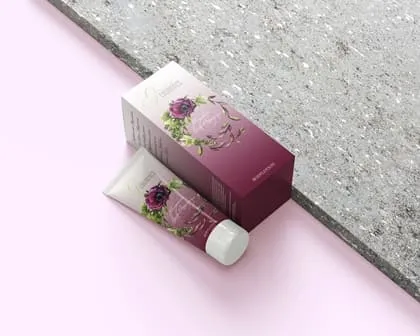 this combination offolding boxand laminatetubeis the product packaging for a body lotion. It is a product of a manufacturer for natural cosmetics. Manufacturers of natural cosmetics often want to convey values such as health, closeness to nature and balance with their products. The box and the tube of the product packaging are kept in a uniform design and convey through the colors used and the design properties that can be well associated with natural cosmetics. The purple tones of the beautifully printedfolding box with tuck-in flapcan be associated with calming and luxury, while the green of the logo can convey health, calm and relaxation. All characteristics that go well with each other and with natural cosmetic products. In this way, the packaging design is in harmony with the brand message and the product being sold. To create a uniform image, the laminate tubes are also printed in the same design. In this way, the corporate design can be memorized by the customer and the values of the corporate identity are conveyed.
High quality finished beautiful product boxes
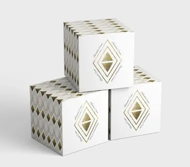 This folding box with insertion flap in the shape of a cube is the product packaging for a high-quality cream. The cream is made of noble ingredients and promises intensive and luxurious care. The packaging is made of high quality bright white cardboard and is finished with gold hot foil stamping. The design of the beautiful box is subtle but still stands out. Thus, the box stands out at the POS due to its luxurious appearance. The features of the contained product are perfectly showcased and highlighted by the beautiful box. Thus, the seller is able to convincingly convey his brand message with the help of the finishing technique of hot foil stamping.
Beautiful box as perfume packaging
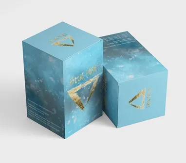 This folding box represents the outer packaging for a ladies perfume. The beautiful box is printed in accordance with the brand name "Blue-Night" in different shades of blue. Blue can stand for refreshment, since this is a perfume with citrus notes this is a characteristic that harmonizes with the product. Other qualities that the color blue can convey are strength and authority. For some people, these qualities can be a deciding factor when buying a perfume. The brand name as well as the logo of the brand are applied to the box with golden hot foil stamping. They visually stand out against the blue design of the box. This makes the logo stand out and can thus increase recognition and brand awareness.
A beautiful product box should encourage the customer to continue using the packaging even after its original use. In this way, the company and its design can continue to make an impression on the customer, which strengthens brand loyalty. In order for a box to remain in use by the customer for a long time, it should be of an appropriate quality. If the right material is used, the box can be used for a long time. Different types of paper with noble coatings are suitable for beautiful boxes. Other possibilities to realize an even longer durability are boxes made of metal, wood, plastic, textiles or glass. Always look for high quality when buying product or gift boxes for your customer. This way, even the box can speak for the quality of your products.
Diese Artikel könnten Sie auch interessieren:
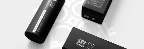
Cosmetic packaging
When it comes to cosmetics packaging, the first impression often decides whether a purchase is made or not. Due to the saturated market, manufacturers are forced to present their cosmetic products in ever new packaging designs.
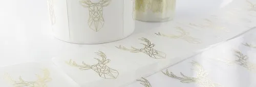
Refinements that leave "imprinting" impressions
There are two main reasons to justify the cost of additional finishing of packaging materials after printing: The additional protection and the emotional attachment.
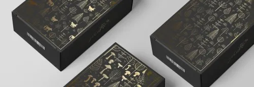
Black cardboard: noble material for special purposes
At first glance, folding cartons serve only one purpose: to package various products. Our range of materials for folding cartons includes different cartons in various thicknesses and basis weights.

